![]()
Long before photography was even a dream, people were trying to document the beauty of landscapes in a two-dimensional medium. From romantic interpretations of natural beauty to the realistic and mystifying Hudson River School painters, there have always been trends in how we see the landscape.
As photography became the more accessible method of capturing these scenes, we see new trends in composition and style come and go in years rather than decades. On the other hand, we see elements in modern photographs that work just as well as they did centuries ago in paintings.
This story is brought to you by ELEMENTS Magazine. ELEMENTS is the new monthly magazine dedicated to the finest landscape photography, insightful editorials and fluid, clean design. Use the PETAPIXEL10 code for a 10% discount off the annual subscription.
Technology plays a major role in current popular composition styles. Before developments in photography made the use of wide-angle lenses common, it was quite rare to see someone paint a scene with such a wide field of view. The majority of landscape paintings from the last half-millennia have a rather natural perspective, sometimes compressed, making the distant peaks look as if a telephoto lens had been used.
But once photographers were able to access extremely wide-angle lenses below 75mm on 4×5, people started working with new ideas in composition. We saw increasingly large foreground elements come closer to the lens as the photographer could tilt the front standard and bring the entire scene into focus. This trend became even more notable as extremely wide lenses for full-frame digital cameras such as 14mm became inexpensive and commonplace. With the addition of focus stacking techniques, we now regularly see images where a flower is just a couple of inches away from the camera in a grand scenic landscape with towering peaks in the distance all in sharp focus.
The same can be said about the usage of drones to create compositions that were impossible for the average photographer. We also have editing techniques that allow people to stretch mountains, relocate elements, or stitch together panoramas with a vast perspective. Today we have almost shifted back to the world of painting as the creative tools available to us mean we are no longer limited to reality. Now because we see things change so quickly in the world of photography, what does make a compelling landscape photograph?
Composition is probably the most powerful tool we have in landscape photography. It involves not only how the image is composed but how it relates to the message we want to relay. Is it an epic mountain scene that calls for a variety of elements or a stark desert landscape that calls for a composition equally stark? Storytelling is all the talk in photography, but it can be difficult to convey a story in a stand-alone landscape image. When creating a series of images, it becomes much easier to piece together a story that develops with the photographs. With landscape images it’s certainly possible — and encouraged — to create a series but we also want each image to be strong on its own. Choosing compositions that connect with the landscape gives us an edge in telling a story with a single image.
Choosing a composition means including or excluding elements in a scene. Part of the mystery of photography is that you never know what is behind the photographer or even just outside the image. Focal length choice affects how a scene is composed, but going wide doesn’t mean that the scene will become cluttered; long focal lengths don’t automatically make for a minimalist composition. Each landscape has particular qualities and each photographer captures them differently.
![]()
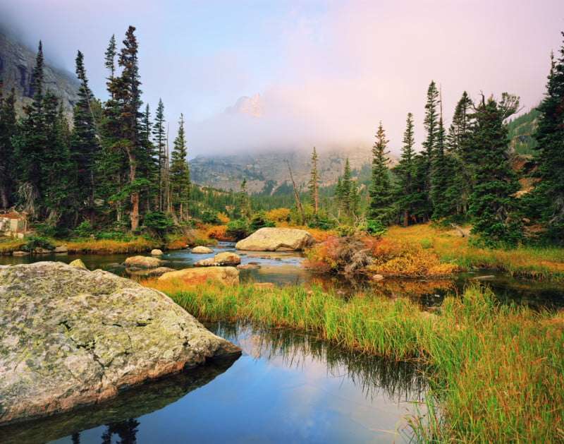
In a mountain wilderness, I often find myself boxed into a valley or high up on a ridge with so much in the landscape around me that it’s hard not to try to capture it all. Generally, I find myself reaching for a wide lens such as 75mm or 90mm on 4×5 as the peaks are so close that only a wide view can include them. It becomes important not to include everything; the scene must remain visually organized. Typically, I try to find an anchor to weigh the image such as a meandering river leading to a towering peak or a gap in the forest that reveals a view of the mountain wilderness.
Over the years I have moved away from placing a large subject in the bottom third of the frame close to the lens. Instead, I try to keep the view more natural and place the camera between chest and eye level. This allows me to work with a mid-ground that brings the scene together instead of having a foreground and background with less visual tension. It also allows me to use a wide-angle lens without the photo looking too wide and distorted. If I want to exaggerate the foreground, a touch of rear tilt on the field camera enlarges it slightly in relation to the rest of the frame, although this is rarely needed.
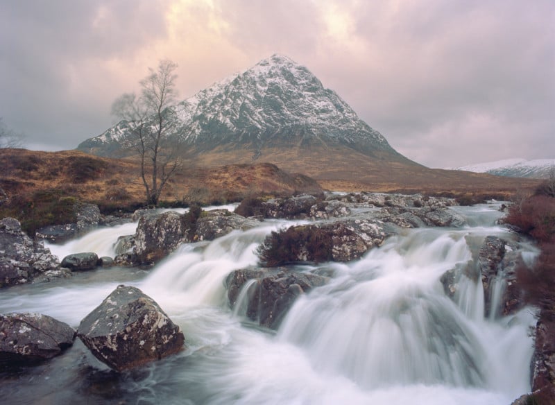
I often compose my images in a way that is rather center-heavy. Supporting elements from around the frame build upon the central subject, creating an emphasis near the middle where you want the viewer’s eye to gravitate. This is especially useful when the goal is to make prints that fill an entire wall. Something about the powerful center creates a special emotion when standing in front of a print that is as tall as you are. The goal is not just to put things in the middle, but rather to build upon the central region of the image by carefully placing the surroundings. In mountainous regions, I often use the natural “V” shape of the valley to bring in all four corners of the frame.
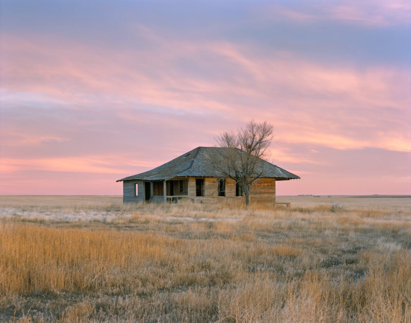
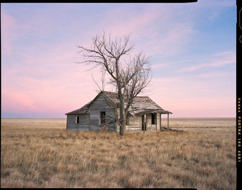
Wild mountain landscapes first attracted me to photography and it took a few years to discover the beauty of the prairie. At first, I found myself trying to compose images in a similar way for both, but eventually found that a different approach for each region worked better. A minimal approach seemed to fit the prairie better so I strove to isolate a single subject against the backdrop of the plains.
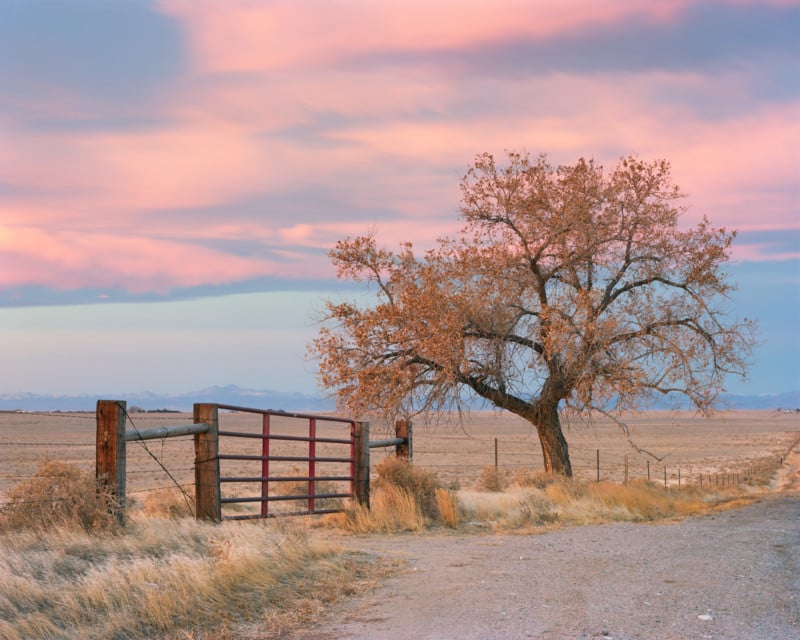
The interplay between the subject and the sky became more important. Longer lenses help achieve some of this isolation, with the 210mm now being my most used focal length when working on the prairie. To me, keeping the images simple in composition brings out my emotions in the vast expanse of land. As you stand under the skies of the Great Plains, you feel a powerful sense of solitude. Sometimes no single object rises above the horizon in any direction. My choice to bring attention to this solitary feeling helps to tell the story of the landscape as I see it. Part of the beauty of storytelling is that we each find a different narrative even when viewing the same landscape. Put ten photographers in the same spot and it’s possible that ten different emotions and resulting images will emerge.
![]()
What else works with storytelling and composition to make a compelling photograph? Subject matter certainly plays a role, although in landscapes we often seek out natural beauty which comes in countless forms. By telling a story, nearly any subject becomes worthy of a viewer’s attention. I am not trivializing the importance of subject; often what we choose to photograph will greatly influence how we go about doing it. Other elements include aspects of an image such as atmosphere and light. These fall in the category of things that can’t be controlled by a photographer in a natural-light landscape setting, but we can choose how to make that light work by seeking out the right conditions.
Achieving the desired conditions requires legwork and planning. If your goal is to create moody mountain scenes, then it helps to observe and learn weather patterns and go when the clouds are low and the monsoon moisture brings the storms. Sometimes we seek out conditions more common for the region such as the way clear-sky twilight works well in the desert. The arid southwest regions of the US are often plagued with clear skies—the bane of most landscape photographers—but if you wait until after sunset, you’ll find those clear skies are a blessing when the red rock starts to glow even more brightly than the deep blue twilight skies.
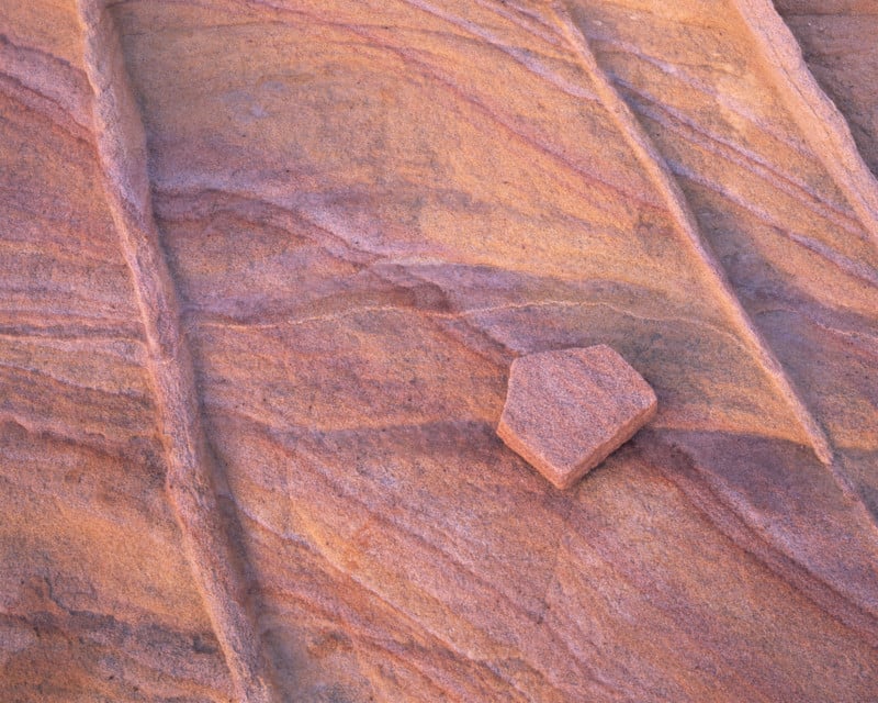
There are many ways to create stunning landscape images. I trust that in the coming years we’ll see ground-breaking work from many people that modifies our current ways of creating an image. We will also see new trends that come and go in a flash. It’s hard to know what will stand the test of time but it’s always worth striving to produce a stunning image.
The article is courtesy of ELEMENTS Magazine. ELEMENTS is the new monthly magazine dedicated to the finest landscape photography, insightful editorials and fluid, clean design. Inside you will find exclusive and in-depth articles and imagery by the best landscape photographers in the world such as Freeman Patterson, Bruce Barnbaum, Rachael Talibart, Charles Cramer, Hans Strand, Erin Babnik, and Tony Hewitt, to name a few. Use the PETAPIXEL10 code for a 10% discount off the annual subscription.
About the author: Alex Burke is a large format film photographer from Greeley, Colorado. Specializing in landscapes of open prairies and remote wilderness regions, he works with sheet film to capture images with endless detail and a unique color palette. Alex also aims to educate new and experienced film photographers through his blog and ebooks.
Header image: A lone tree covered in hoarfrost on the prarire. Weld County, Colorado – February 2019 | Portra 160 4×5, 135mm lens, 1/8th second at f/22, no filters
No comments:
Post a Comment